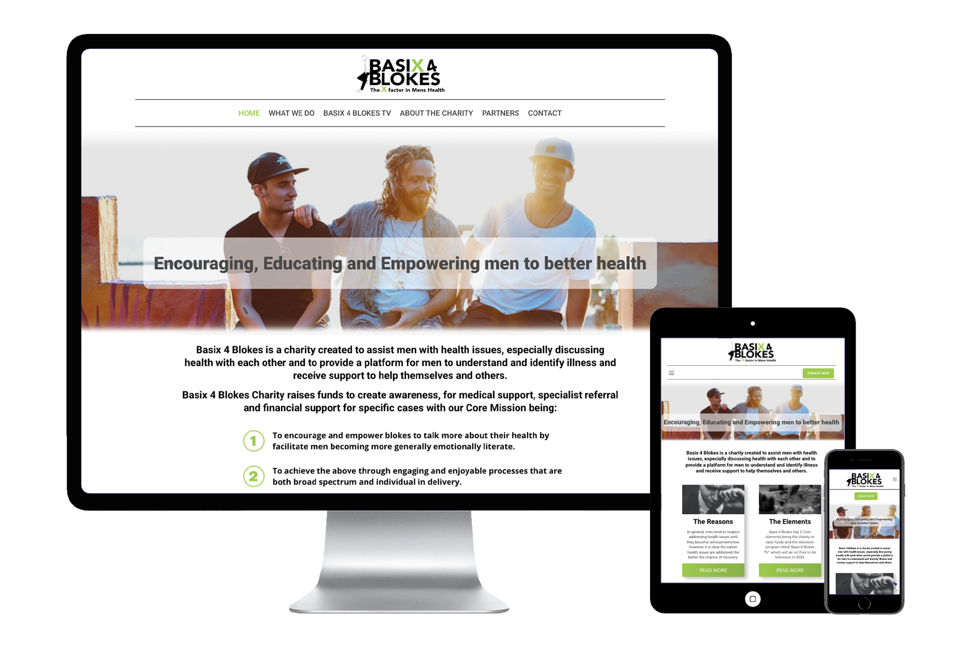
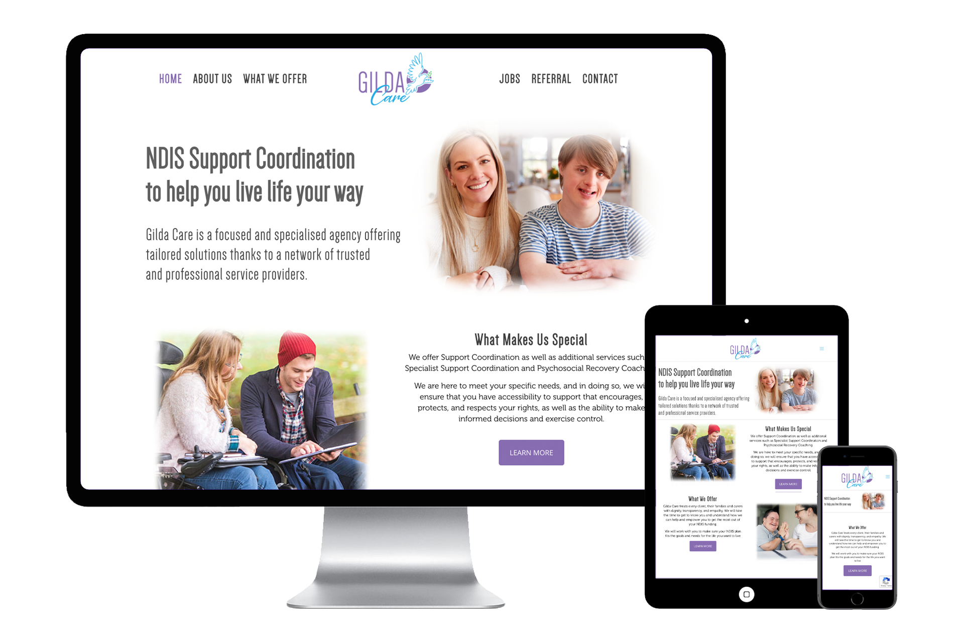
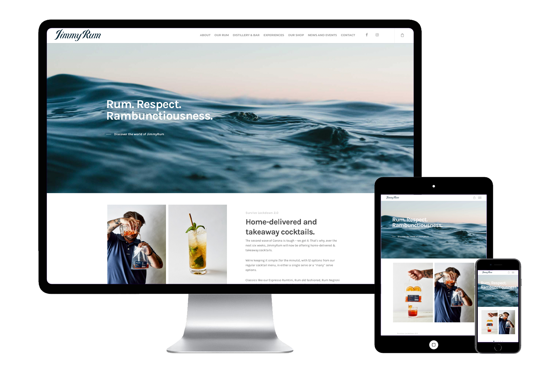
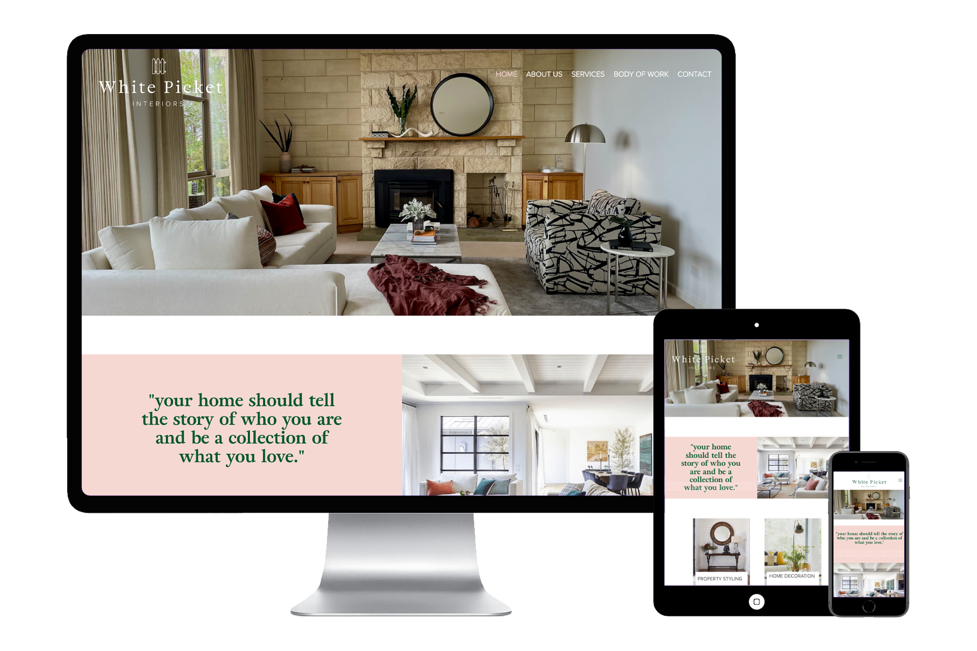
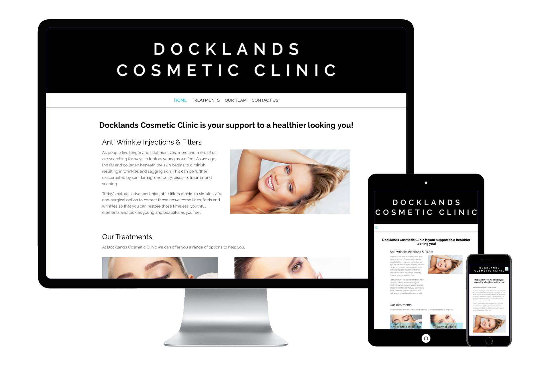
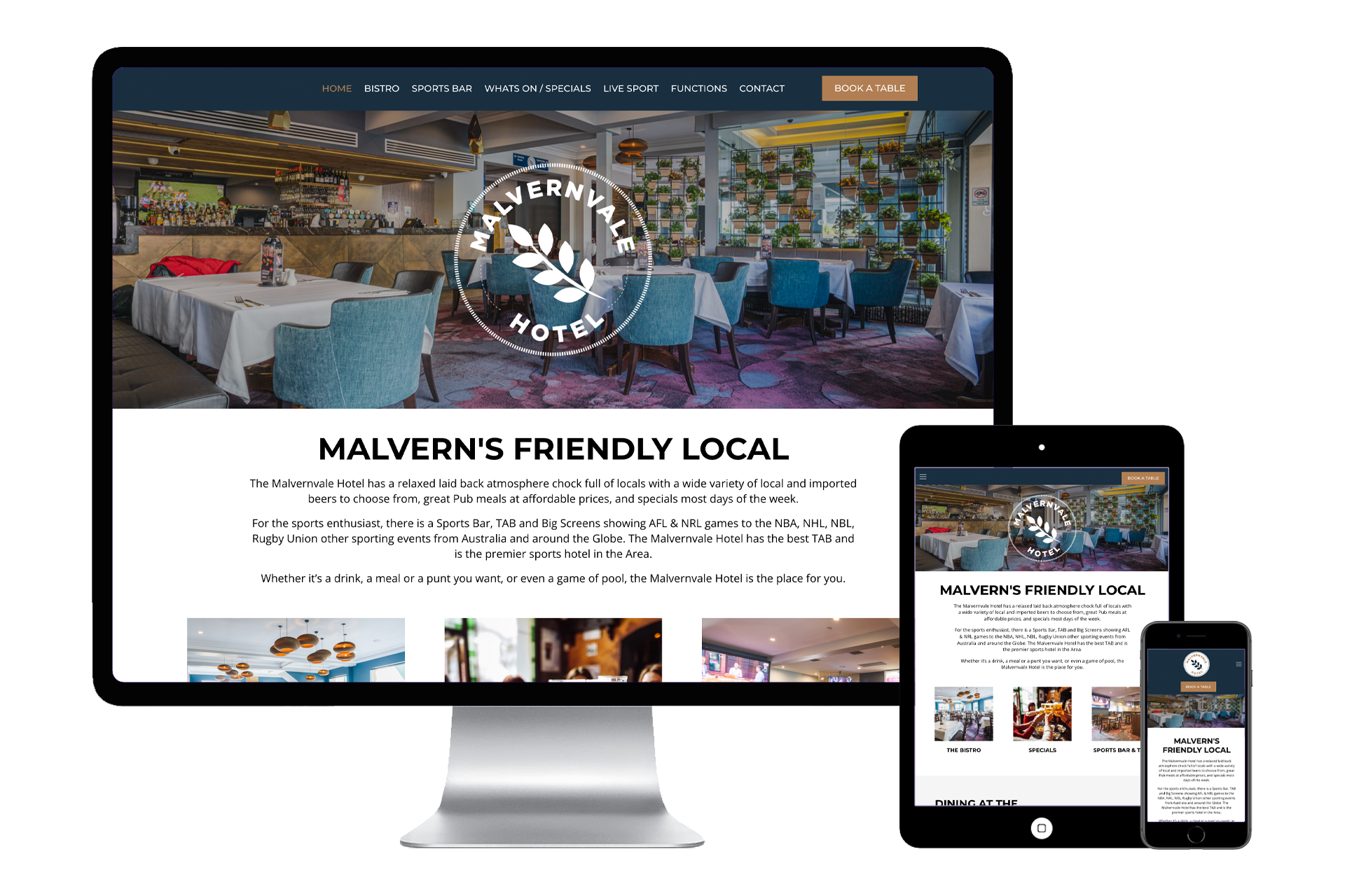
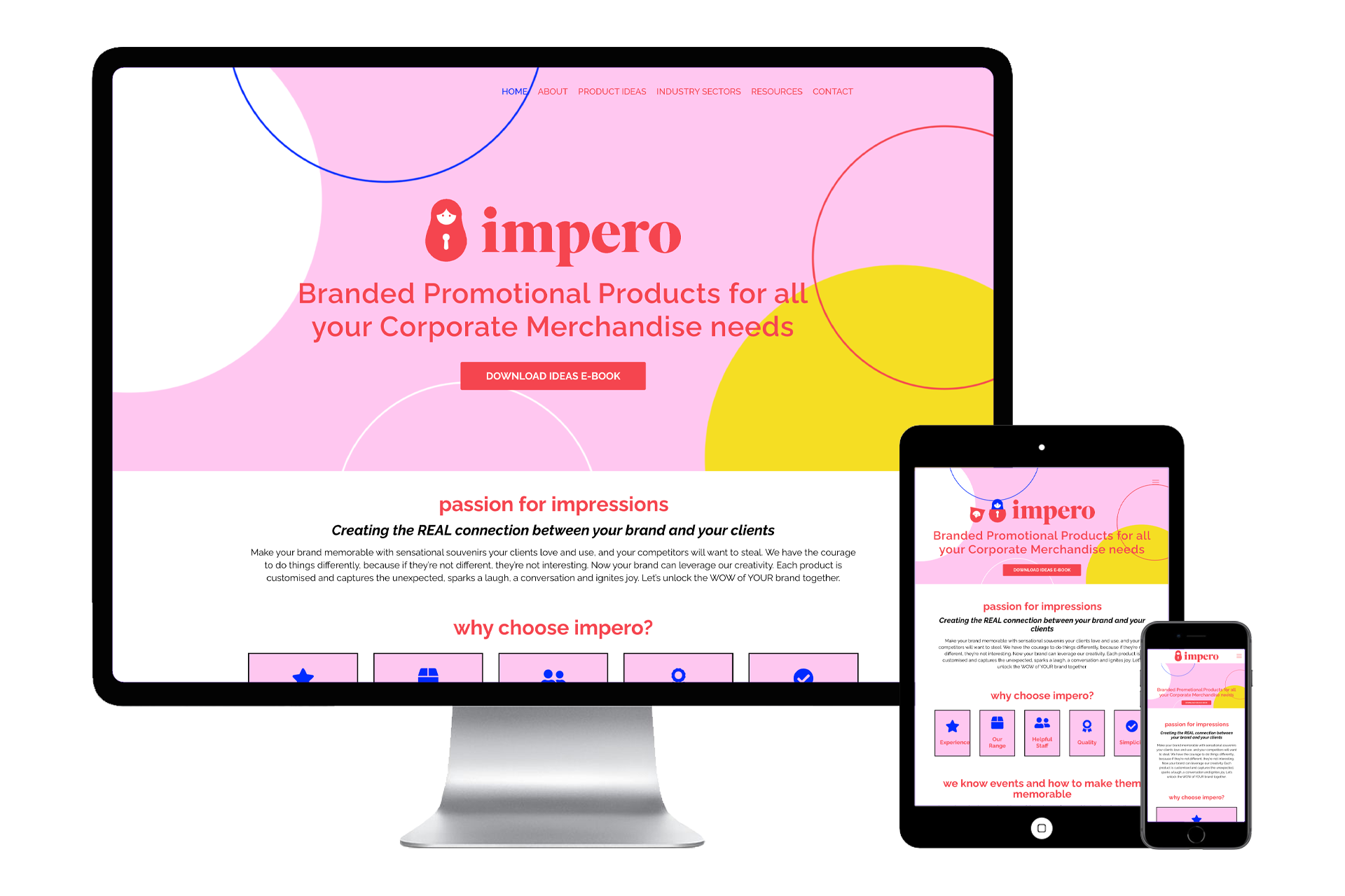
 Your online presence is a huge part of your brand identity. And with more and more of our lives being conducted online on a day to day basis, your website is essentially the face of your business. Getting your website design just right is therefore key to your success and a major part of that success are the colours you choose.
Even without researching the topic of colour psychology, you probably already know that certain colours can spark different emotions and meanings. Your favourite colours are often underlying factors behind the way you decorate your house, the clothes you wear, the car you drive, and even the food that you’re most drawn to.
Colour choice is significant in branding, marketing, and web design, too. In fact, colour can be up to 85% of the reason people decide to buy from a company. Colour can build or demolish brand trust, increase or destroy customer loyalty, and form 90% of a customer’s opinion of a brand… all within just 90 seconds.
So when you set out to commission either your first website or a redesign of an outdated one, it should be no surprise that your web designer will quickly ask about your preferences regarding website colour.
Before you blurt out an answer based on your personal favourites, read through our tips for making smart web design decisions based on the psychology of colour.
When designing or re-designing your website, there will be many aspects to consider from logos and layout to page speed and search engine optimisation. But perhaps one of the most powerful and often overlooked aspects of website design is the use of colour psychology.
What is the colour psychology?
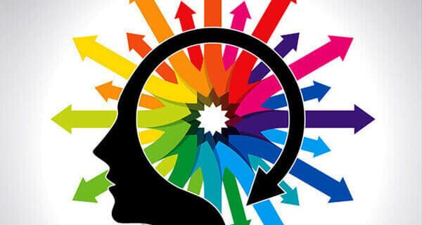
Colour psychology is the research into how different colours can create different reactions and encourage different behaviours in humans. For decades, advertising and marketing gurus have been using this knowledge in their campaigns.
From a web design perspective Trilogy will look at three core Colour Psychology
- The meanings associated with each Colour
- Your Target audiences’ colour preferences
- The colours associated with different industries
1) The general meanings associated with each colour
Blue
Blue naturally suppresses appetite, so using it on a food-based website may be off-putting to visitors. Many people suspect that the reason for this is that there aren’t many everyday foods that are blue. But outside of the food world, blue is one of the most popular colours with both men and women. Because so many people naturally gravitate toward it, businesses often choose this colour when they want to reassure or inspire trust.
Yellow
Yellow is fun and playful, but you have to remember that it’s also used for warning signs. It’s an energetic colour that heightens emotion, which builds excitement for your website visitors when used in small doses but quickly becomes abrasive and overwhelming in larger amounts. As an accent colour, yellow can be the perfect solution for calling attention to a specific call to action.
Green
Green has such strong associations with nature and being environmentally friendly that the colour alone can send a message that a company is ethical. Also, green is becoming more and more popular since it offers both the relaxing qualities of blue and the energising effects of yellow. Other common associations include money and growth, making this an increasingly popular choice across a variety of industries.
Orange
Orange is the new black the new red, but it’s a tricky colour to work with. Although it’s a favourite among kids, most adults either love it or hate it. So incorporating it into your website that’s targeted at adult buyers should be done strategically and if you are targeting women then not at all as it women’s least favourite colour. Orange is strongly associated with energy, excitement, enthusiasm, and warmth, so for certain businesses, this colour can play a key role in establishing your brand’s personality and getting site visitors to take action.
White
If you’ve ever heard the term “white space,” you may have some idea of how important the colour white is in web design. White conveys a sense of freedom, which allows your site visitors the visual breathing room needed to absorb the information you present.
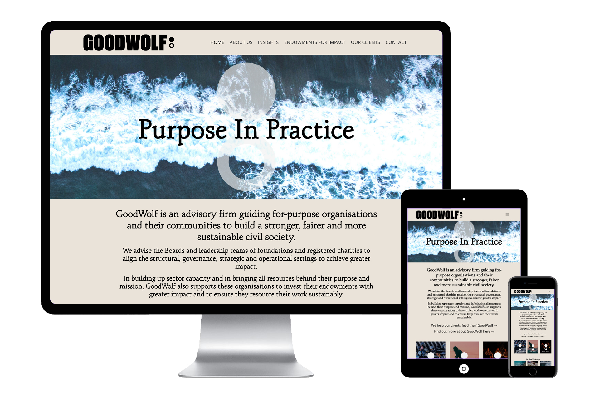
But white comes with a pretty important drawback, too: It can be difficult on the eyes when true white (#ffffff) is paired with true black (#000000), and can be seen as cold, stark, or off-putting. A thoughtful solution is to use an off-white like ivory, which offers the same benefits as white but has a slightly warmer tone that is more comforting.
Black
Black is certainly one of the most commonly used colours, but be careful with it, as it has many conflicting associations. For example, it’s edgy, but it’s also corporate; formal, but also traditional. When used sparingly, black can lend a grounding effect, but can easily dominate your entire design when used too liberally.
The good news is that both black and white have many, many tones between them, so using darker shades and lighter tints can offer the same advantages with fewer drawbacks.
Red
Red evokes strong emotions, perhaps because it’s one of the most visible colours in the spectrum. Red is typically associated with love, passion, and drama, but can also signify power, aggression, or even anger. As such, it’s recommended in small doses.
Since it so strongly promotes action, many web designers argue that it’s the best option for buttons and other calls to action, however don’t feel it’s your only option as its still important to have your brand guide in mind when deciding the colour on Call to Action buttons.
Purple
Like orange, purple can be polarising — it will likely draw in female customers but immediately repel male customers. Purple combines the power of red with the stability of blue, which contributes to its sense of regal luxury. Purple can also signify mystery, creativity, or wisdom. It certainly isn’t recommended for all industries, but for a select few, it can be the perfect choice.
Pink
Pink has strong associations with gender and is often used to symbolise femininity and softness. In lighter hues it can seem delicate and fragile, like a flower, while in more intense shades, it can seem euphoric or boisterous. Like red, pink signifies love, but it’s a gentler, more intimate type of love than the burning passion we associate with red. This softness lends itself well to baby products, as well as confectionery.
Brown
Brown is the least popular colour for web design. Both men and women dislike it, and it can be difficult to pair it well with other colours. Its positive connotations are dependability and ruggedness, but it takes a keen eye for design to keep it from looking bland and dark.
2) Your Target audiences colour preferences
It is also extremely important to overlay the general meaning of colours with who your own target audience is and then use the colours that they have a preference for because age and gender play a big part in this decision.
Whilst point one also included a bit of information about colour preferences across genders, but did you know that there have been pretty in-depth studies conducted on this very topic? It’s more than just “women like purple and men don’t.” There’s actually a ton of interesting information about gender and colour preferences
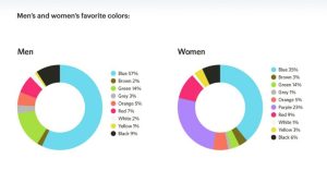
The world’s favourite colour is blue (with 57% of men and 35% of women saying it’s their favourite colour).
Men’s favourite colours are blue (57%), green (14%), black (9%), and red (7%). Fewer than 5% of men said that orange, yellow, brown, grey, or white was their favourite colour, and 0% of men said purple was their favourite colour.
Women’s favourite colours are blue (35%), purple (23%), green (14%), red (9%), and black (6%). Fewer than 5% of women said that orange, yellow, brown, grey, or white was their favourite colour.
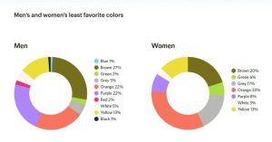
Across both genders, orange and brown are the least favourite colours, with 22% of men and 33% of women disliking orange and 27% of men and 20% of women disliking brown.
Overall, men prefer bright colours and women prefer softer colours.
But your target demographic can be defined by much more than gender. There are also colour psychology-related statistics regarding age, class, education, and even climate. Check out these interesting facts:
- Young children prefer brighter colours of red, yellow, blue, orange, green, and purple. They also prefer solid blocks of colours over patterns.
- Teenagers often prefer black and are open to more graphics and sophisticated colours than their younger counterparts.
- In general, most adults prefer subdued colours, and their colour preferences are set in stone.
- Adults older than 65 tend to dislike yellow and prefer blue, pink, and green. They tend to prefer calmer hues over bright, stimulating ones, and purple becomes even more popular among women the older they become.
- People in the working class tend to prefer bright variations of the primary and secondary colours. Meanwhile, wealthier people tend to prefer more complex colours, often preferring tertiary colours with a variety of shades.
- The more educated an individual is, the more sophisticated their colour choices usually are. Well-educated people tend to prefer tertiary colours, while less educated people tend to prefer primary and secondary colours.
- People tend to prefer colours that duplicate the colours relating to their climate. People from tropical climates respond best to bright, warm colours, while people from colder climates prefer more subdued colours.
3) Colours Associated with Different Industries
While your business’ goal is likely not to completely blend in with your competition, there are certain colours that just work well with particular industries (and other colours that can send your users running away).
Common colours across industries include:
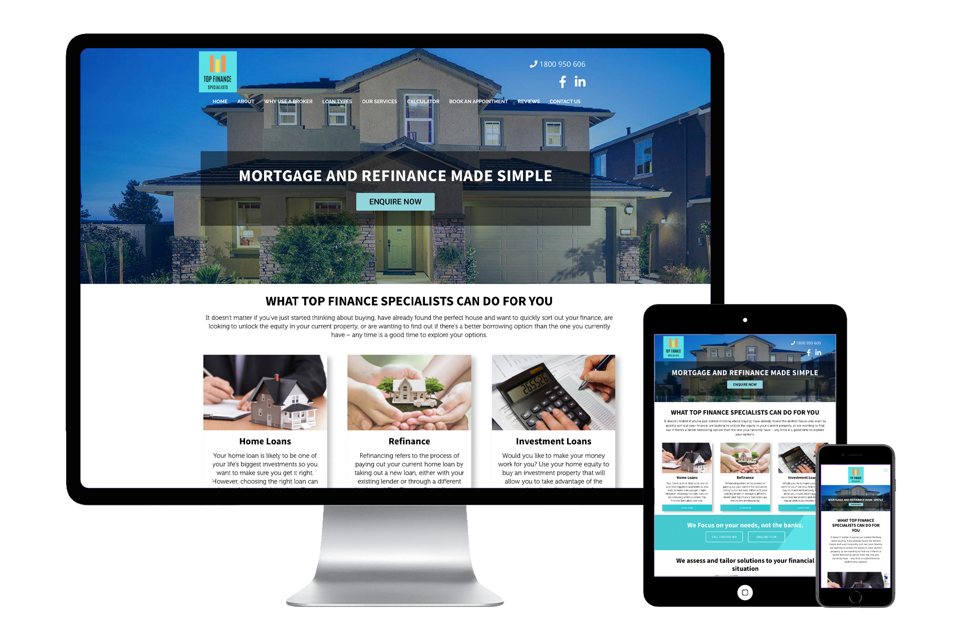
Blue: Medicine, science, utilities, government, healthcare, recruitment, legal, information technology, dental, corporate, finance
Green: Medicine, science, government, recruitment, ecological business, tourism, human resources, finance
Black: construction, corporate, oil, finance, fashion, manufacturing, cosmetics, mining, marketing, tradesmen
Grey: automotive, journalism, sportswear, technology
Red: fashion, makeup, food, dating, video games, retail, automotive, hardware, video streaming
Orange: drinks, retail, fitness
Yellow: automotive, retail, food, technology, construction
Pink: Medical (paediatrics, OB/GYN), food, cosmetics, retail
While these trends shouldn’t restrict you as you choose the colours for your website, they are trends for a reason. Chances are, your company’s overall message is pretty similar to that of your closest competition, so choosing a colour that’s a complete curveball for your industry could hurt (by sending the wrong message to customers) more than help (by making your brand stand out from your competitors).
How can I use this on my website?
When it comes to using colours, don’t be afraid to brainstorm and experiment with different designs before publishing them on your website. Taking the time to really think about how you want to be perceived will ensure that your branding is consistent and powerful.
Logo
If you’re yet to design your company logo, you should seriously consider colour psychology in the design process. Your logo will not only appear front and centre on your website, but also on all your products and promotional material. Getting the right colour on your logo is key to sending the right message to your customers and making sure you have a solid brand identity.
Main Page
When designing your main website page or homepage, you should first thing about how you want your business to be perceived by visitors. Then you should consider what exactly you want to encourage those visitors to do.
Your website is your first impression so don’t overload it with too many colours and too much information. Keep it simple but effective. Check out our previous blog on things to avoid relating to colours.
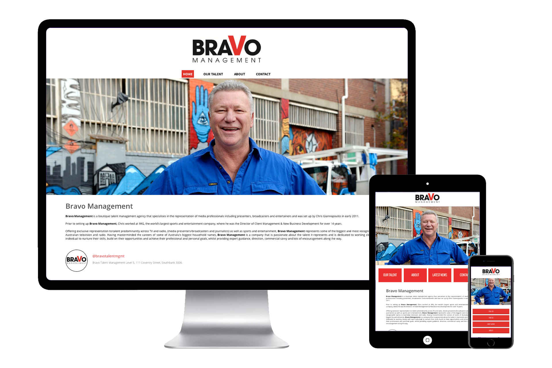
An overall colour scheme or theme is a great way of ensuring your entire website is on-brand. For example, a company delivering organic produce straight to your door may use a white backdrop with green writing to symbolise health, wellness and purity.
Meanwhile, a discount furniture store may want to use an orange motif to highlight the bargains they can offer their customers.
In Summary
Using different colours as part of your website design is a simple yet highly effective way of engaging your customers and securing your brand identity. Don’t be afraid to experiment with different colours, especially at the brainstorming stage but make sure you keep a sense of uniform across your entire website and overall brand.
If you already have a logo with a set of Colours you want to stick to, there are still steps you can take to use Colour psychology to your advantage without entirely reworking your brand. Simply adding different calls to action and varying the amount of white space on your website can make a huge difference.
Finally, it doesn’t all boil down to the specific Colours you choose. While Colours do have different meanings and certain demographics have their preferences, the most important factor is how a user perceives the Colour as relating to your brand.

